


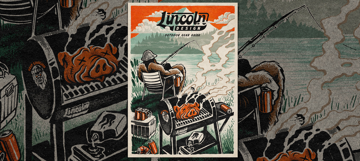
Illustrating An Outdoors Guide With Lincoln Design Co

.
In this tutorial, I’ll be showing you the process I use to take an illustration from brief to execution. We'll experiment with brushes and textures and I'll share a few insights, tips and tricks along the way.
True Grit Tools & Apps Used:
✓ Rusty Nib Brushes
✓ Stipple Studio Brushes
✓ Gritty Vignettes Tiff Textures
✓ Adobe Photoshop
✓ Wacom Cintiq
Software skill level:
I'll be breezing through some of the technical stuff but if you've got a handle on the basic functions of Photoshop, Procreate or Affinity Photo you'll do great!

Part 1:
Brief & References.
Even though this is an internal project for fun, we still like to start by setting ourselves an informal brief. Just because there's no client in the traditional sense, doesn't mean you shouldn't spell out what you're hoping to achieve. You can't get to where you're going if you don't know where you're starting from!
Here at Lincoln, we love the outdoors and work regularly with clients in the skate, snow, mountain and action sports worlds. So, after having a chat with the team at True Grit we decided to create a fictitious Lincoln Design Outdoor Gear Guide featuring our unofficial studio mascot, BigFoot.
I put together a quick visual brief with references and notes to help guide the project. I want the finished piece to be a nod to the past with a distinct Lincoln Design feel.
General vibe and typography placement

Modern interpretations for reference

Concept

Part 2:
The sketch.
Now that we have a plan, it's time start sketching. This is one of the most important parts of the process.

Here, we have a well balanced sketch with a grill smoking away in the foreground whilst our BigFoot character takes it easy with a beverage by the lake, waiting for the fish to bite. The composition draws the eye into the foreground whilst leaving some space at the top of the page for our typography.
Sketching digitally on a pure white background can feel a little soullesss sometimes, so even at this early stage, using a paper texture template from the Stipple Studio pack to help the process feel a little more organic and get me into the right headspace.
Tip: Don’t rush through the sketch as it’s a critical stage of the project. Put some thought into it, but don’t worry abut it being 100% perfect. The composition is the most important part of this stage.
Part 3:
Inking your line art.
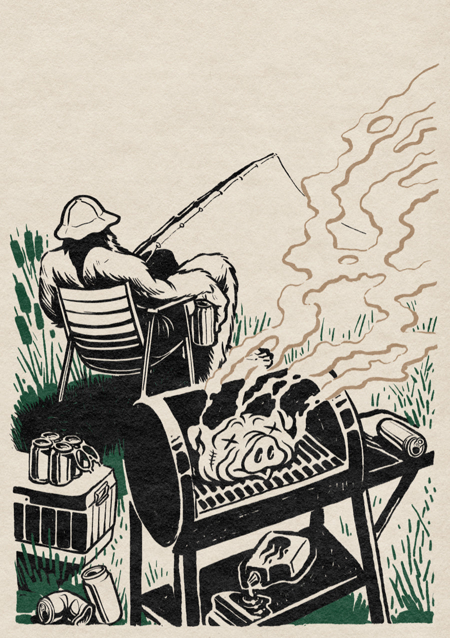
Turn down the opacity on the sketch layer and create a new layer to start inking your line art.

Here, we’re working with a brush that compliments the background texture. In this case, I'm using the Crusty Brush Pen from The Rusty Nib pack.
I treated it as if I were using an old “crusty” sharpie marker. And just like a real marker, I don't change the size of the brush, keeping it to 20px throughout. The variations in the line values are a result of the pressure applied to my tablet.
You'll notice in the video that I regularly rotate my canvas so that I can make strokes at an angle that feels best ergonomically. Think of it like rotating your paper when you're working with analogue materials.
Tip: Optimize your stroke angles by rotating your canvas and stick to a single brush size, making use of your pen-pressure to vary the width of your strokes.
Part 4:
Using color in line art.
“All line art should to be black”… says who?
Black is the absence of light... it’s not a color. Apply this principle to you art, even if it’s digital. Okay, so maybe I did use black for some of the line art. But we’re also exploring different colors to define lines.
Compare the two examples below. One screenshot shows all line art in black. Notice the lack of depth and creativity in application. While I don't necessarily hate the heavy black line art style, I want to create some separation between the various elements in my linework.

As you can see the green reeds and beige smoke lines help define these elements more clearly against the more dominant grill and yeti.
Here’s how it’s looking so far:
Part 5:
Adding color fills.
Next up it's time to add color fills. Notice how intentionally filled the colors loosely on the the hog, beer cans and grill. Those imperfections give the artwork a more hand-made quality. We tend to gravitate toward these characteristics in art, as they are easier to relate to. As opposed to perfect vector art which wouldn't quite capture the more traditional aesthetic we are trying to capture.

Part 6:
Adding stipple shading to bring form and perspective to the composition.
Now that my line art and color-fills are complete, I want to add some stipple shading to bring additional dimension to my work.
I'm switching between the Round Precision and Pressure Scatter brushes from the Stipple Studio pack to create a detailed "spray-style" stipple effect, working quickly without getting too carried away with exact dot placement.

Notice how I've broken up the heavy shadow under the yeti's chair with a hint of grass and added some extra dimension to the hogs head on the grill.
Part 7:
Using negative space
Notice how some areas in the piece don’t have line art at all. That’s on purpose.

We’re going to be placing our Logotype at the top of the composition so we don’t want any heavy line art creating legibility issues.
Think about ways you can use the negative space to establish surfaces and edges. This technique work best if applied to less important elements such as the background and helps create a sense of distance in the sky and mountains.
Part 8:
Adding a subtle textured vignette
We’re nearly done now and it’s looking really solid!
What do you think? Should we add some extra texture over the entire piece to give it more depth? Remember, we’re trying to capture a time period with this illustration, not just a cool drawing.
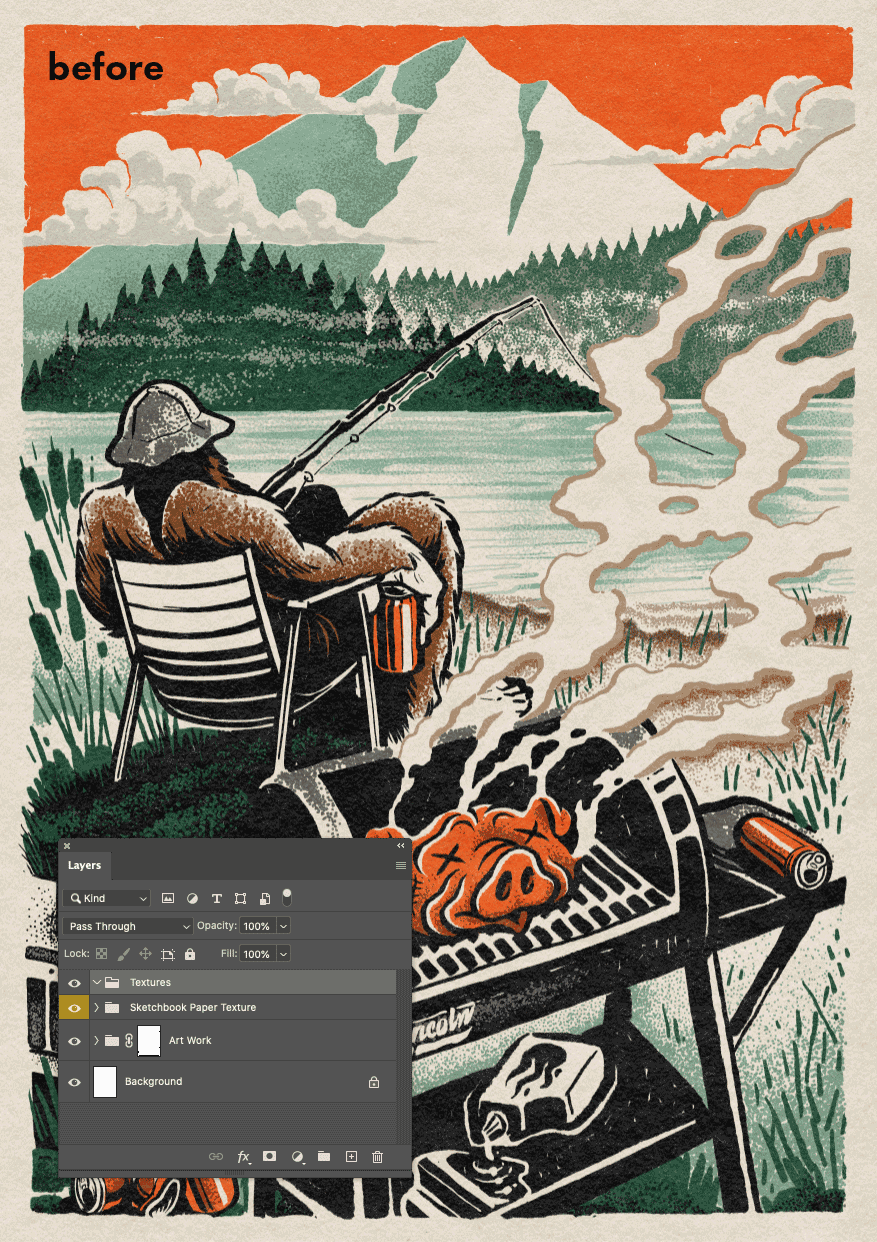
To do this I’m going to drop in a couple of textures from the Mixed Grit and Gritty Vignettes packs. I simply copy and paste them, then change the layer blend mode to Overlay with the opacity set to about 30%.
It’s a subtle effect but it helps to draw the eye to the center of the composition. As a bonus it gives the finished artwork a nice vintage patina.
Part 9:
Don't be afraid to edit yourself
Before I add the logotype, I’m going to take a little step back and see where I can clean things up a bit or improve the composition. The biggest thing I’m noticing is that the trees in the background don’t recede into the distance quite the way I’d like. This will make it difficult for my logotype to pop.
So, I’m going to hide the tree stipple stipple layers and lighten their fill color by reducing their layer transparency. This helps create a more distant perspective by simulating the density of the atmosphere when observing objects in the distance.
I’ve also removed some of the detailed stipple at the shoreline to help blend the water into the foreground and bring the main subject into focus.

Part 10:
Finishing up with type
Finally, I’m adding the Lincoln Design logotype and masking part of it behind the clouds to further emphasize the perspective and create a sense of subtle movement in the background. You can almost see the clouds drifting apart to reveal the logotype.

Aaaaand we're done!
Our Outdoor Gear Guide cover is complete. Thanks so much for following along and if you'd like to find out more about the kind of work we do here at Lincoln Design, check out our work and socials below.
More about Lincoln Design
Website | Instagram
Featured music: Blühmen by Ondolut


